UI Design for a Progressive Web App That Sticks – Tips & Tricks
READ WHOLE ARTICLE

For many people, a smartphone has long become the main source of information, entertainment, and various services. Web resource owners should definitely keep up with such tendencies, providing Android & iOS users with a smooth performance that doesn’t consume too many resources.
That is exactly the reason why the largest market players started actively introducing PWAs – progressive web apps. However, it’s not all about performance. A picture tells a thousand words, as they say, so the user interface of any PWA solution is the first and foremost thing to impact users that launch the app for the time ever.
That’s why it is important to keep up with the relevant design trends, use handy design tools, and not neglect the best practices employed by large market players in order to achieve an impeccable quality the PWA interface and reach for the best user experience possible.
Examples of Progressive Web Apps (PWAs)
10+ Tips to Achieve Impeccable User Experience
Handy buttons
Pretty much all the interactive, clickable/tappable elements of a PWA software piece contribute to the overall level of responsive design you’re going for.
Pay attention to selectable areas.
In some browsers (Google Chrome, in particular), a single click/tap on some icon or piece of text results in its selection. A common bug appears when a bunch of other elements are selected along, which messes up the UX, adding unwanted user manipulations.
So make sure that only the elements that are meant to be interactive are properly clickable and only the content like text, images, etc. (something that a user would want to copy and paste) is selectable.
Use the following CSS line to make buttons and such non-selectable:
user-select: none; Atomic Design Technology: Future of Interface Structuring
Intuitive navigation
When it comes to a navbar and the overall navigation in your PWA software solution, your main goal should be to keep it ultimately simple and concise. You need to make sure that new users won’t get confused upon launching the app for the first time and that it would take them only so many clicks or taps to navigate through the app sections.
Bottom tabs
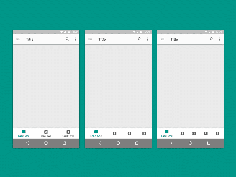
You can make the life of mobile users significantly easier by implementing an alternative format of tabs and buttons. For instance, you can use bottom navigation tabs – that way, users will have a constant access to a couple of major sections/features/tabs (this is one of the major PWA design principles to make the UI ultimately accessible).
This is an especially handy trick for Android users, who are, pretty much, used to seeing this form of menu tabs.

System fonts
A good level of personalization makes wonders. And when it comes to fonts in your PWA, it’s not all about the latest design trends, but more about making users feel “at home” when they an app. This is achieved by using system fonts matching particular mobile platforms. iOS users, for instance, would be more than delighted to see their default fonts in a third-party app and the same goes for Android users (this way, you will also meet PWA material design standards).
These are the most proper, platform-corresponding fonts:
iOS –
font-family: 'Helvetica Neue', Helvetica, Arial, sans-serif;Android –
font-family: 'RobotoRegular', 'Droid Sans', sans-serif;Windows Phone –
font-family: 'Segoe UI', Segoe, Tahoma, Geneva, sans-serif;5 Trends in E-commerce Website Design
Push notifications
These are very important if you are looking to promote your PWA in truly efficient, far-reaching ways. Being independent from mobile platforms and quite cost-effective, push notifications help better lead customers through the sales funnel if we are talking about commercial solutions and keep users up to date as to each and every update if we are talking about non-profit solutions.
Homescreen icon
The homescreen icon is a thing that users see a lot so it should be striking and comprehensive. However, you don’t necessarily have to be a designer to make a good logo.
Most small projects get inspiration from the noun project, where you can easily find the right icons. You can edit them in free GIMP for more authenticity – add a background, change the color scheme, and combine several elements into one image.

Attaching the readymade icon
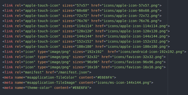
Once you have an application icon, it’s time to attach it to the site. I recommend doing this using the online icon generator. Upload the icon into it and it will offer enough different-sized versions with HTML-code.
Next steps:
- download the file that the generator offers you and unzip it;
- put the icons in a folder with the rest of your site material;
- add the code issued by the generator;
- make sure the icon path works.
I put them all in a subfolder, so I had to add “icons/” to each line.

Colors & visual design
The striking, engaging PWA UX design simply cannot be achieved without the inviting color scheme. Visuals create a mood and motivate users to implement various target actions. All in all, you can find visual design patterns of all sorts, serving different purposes online. Just keep in mind that modern users love minimal and simple shapes, straight lines, warm and light colors.
What Should a Client Know About Design?
Easily shareable content
Proper PWA design guidelines cannot neglect thorough social media integration. Social network sharing buttons are a must. On top of those, however, it would be nice to also add a share button for copying the URL of the whole page to the clipboard – such a feature will certainly come in handy for most users wishing to share what they are browsing at the moment.
Feedback & smooth touch interactions
For one thing, it is important that when scrolling, touching the element does not cause it to open. This will be perceived most negatively by users. Clickable/tappable areas, on the other hand, should provide feedback so that a user feels the response and knows intuitively where to click or tap. The recognition of a tap/click should be distinct so as to not let users wonder in confusions whether their action brings any results.
Conclusion
The general process layout for particular PWA projects may differ a lot from case to case. When it comes to the PWA design, there are many common practices and even some established standards, but if you are looking to achieve an outstanding level of impact with your solution, you’ll definitely need to give it a unique touch.
PWA designers at Multi-Programming Solutions can put their artistic savviness and expertise into your project, making it stand out among the competition and offer engaging user capabilities. Contact us if you have a PWA of your own in mind.

36 Kings Road
CM1 4HP Chelmsford
England


